In my experience as a design manager and teacher, I’ve advised a fair share of designers on their professional growth. Paradoxically, the most valuable lessons are never about tools or techniques. It’s not about how to do better, but about how to think better. You usually don’t learn this stuff in a “UX Bootcamp” or a “Skillshare Course.” These are lessons you get with experience. Through working with talented teammates, dancing with difficult stakeholders, and wrestling with your own failures.
Now, if you’re a junior designer, you’re probably obsessed with technique, and that’s okay. You’ve got to learn the ropes if you want to create digital products. But being a “Figma expert” only gets you so far. So, let me share with you the 6 nuggets of wisdom that have nothing to do with tools but will help you be a better designer.
2. You get better by doing the stuff, not by reading about how to do the stuff
I’m obsessed with knowledge. It’s my favorite drug. It floods my brain with dopamine whenever I find a new nugget of wisdom. But like any drug, it has its downside. I’ve come to realize that, at times, I’m basically just hoarding brain candy instead of feasting on it.
My early years were like a misguided love affair with learning. I’d spend hours reading design articles and watching tutorials. But guess what? Most of it ended up vaporizing into thin air. I told myself that I was learning when actually I was procrastinating. I flipped through articles, watched videos, and thought, “I’ve got this.” I pretended to learn instead of applying the knowledge.
The tricky thing about learning is that it gives you a false sense of knowledge, but the real world doesn’t give a damn about your knowledge parade. It’s not about the act of learning; it’s about summoning the courage to dive into the chaos and apply that wisdom.
You don’t get better by soaking up knowledge like a sponge. You get better by doing the stuff, by diving into the trenches and facing challenges. If you’ve watched an online course but skipped the exercises, you’ve essentially tossed your time into a black hole.

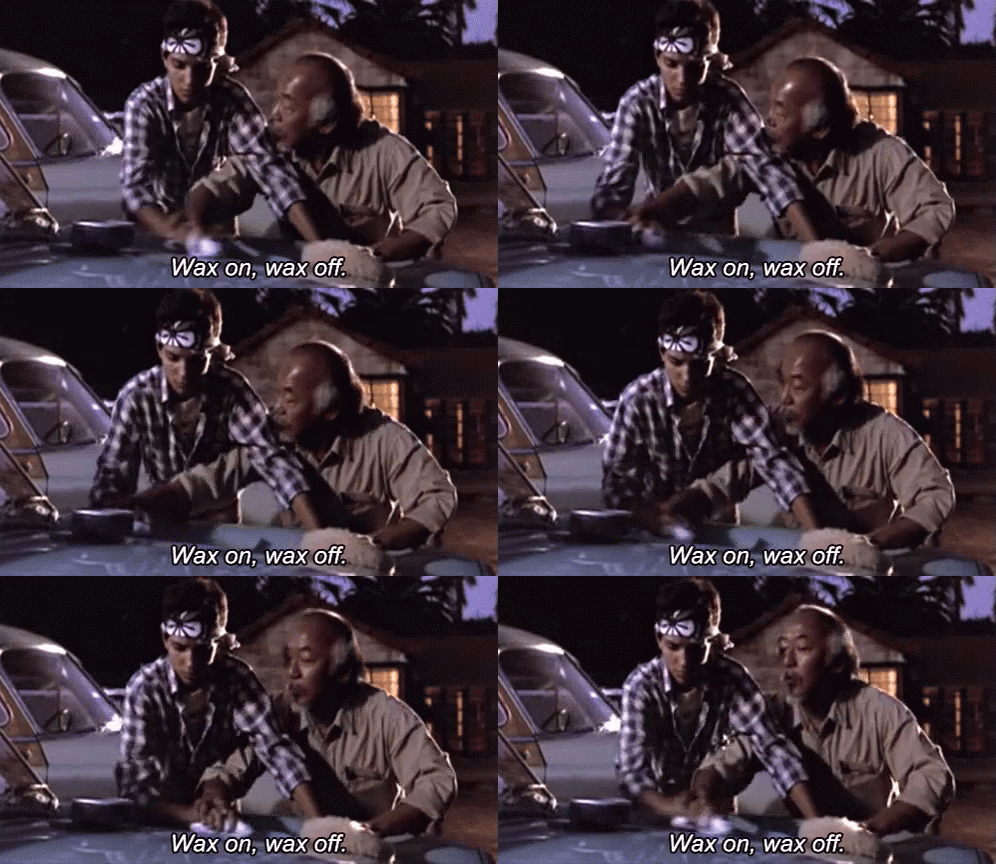
'' Daniel LaRusso didn’t learn Karate by reading books, he did it by waxing on and off.''
People often spend 90% of their time absorbing and a mere 10% applying knowledge. What if I told you to flip that ratio on its head? Read something, then jump into action. Try it out, experiment, and get your hands dirty.
1. Creativity isn’t about inspiration, it is about iteration
Remember those moments from “Mad Men” when Don Draper comes up with a million-dollar idea out of thin air? I used to buy into that too. I thought great designers were those mythical beings who could stare at a blank canvas and by magic a masterpiece would emerge. As it turns out, the creative process is a tad more… convoluted.
Throughout my career, I’ve met lots of great designers. And guess what? They’re as clueless as the rest of us when confronted with a blank canvas. They don’t have a crystal ball that reveals the final masterpiece; instead, they have a magic 8-ball that only draws the words “iterate” over and over.
We treat creativity like a productivity contest. We labor tirelessly thinking that if we push ourselves harder, inspiration will jump out from behind the screen. But creativity isn’t about inspiration, but about exploration. Finding the right idea is like navigating a maze, you will encounter many dead-ends until you find your way to the goal.
When looking for solutions to a specific challenge, remember to cast a wide net before diving deep into a particular route. Explore many paths before choosing the right one. The first ideas are always the obvious ones. Design Thinking workshops are a great tool to achieve this.

'' Finding the right idea is like navigating a maze, you will encounter dead-ends until you find the goal.''
As you accumulate encounters with apparent dead-ends, the map of understanding gradually takes shape. Patterns emerge. You begin to understand why specific ideas work better than others and the path to the goal slowly reveals itself.
Sure, you can find the right path on your first try, but that’s not creativity, that’s being lucky. And you don’t want to rely on luck, you want a strategy to find the right way every time you navigate the maze. This strategy is not something magical, is brute force. The true essence of creativity thrives in trial, failure, and relentless effort.
Your first shot ain’t gonna be perfect. And that’s perfectly fine. Remember Stanley Kubrick, the mastermind behind “The Shining”? Well, he made Jack Nicholson repeat his iconic scene 60 times. Creativity happens when you go beyond the obvious solutions. It’s not about inspiration or genius, it’s about patience and endurance.

'' Kubrick made Jack Nicholson repeat this iconic scene 60 times.''
3. Design is a team sport
The lonesome genius trope is a narrative straight out of Hollywood’s playbook. You know the drill: a solitary designer holed up in a dimly lit room, pulling a rabbit out of their hat and unveiling the perfect solution to the world’s problems. In the world of designing digital products, this solo act doesn’t play out quite as nicely.
Designing is about exploring complexity. No one — and I mean no one — has a monopoly on all the answers. The trick lies in the diversity of minds. If you’re laboring away in solitary confinement, the best you might achieve is a half-baked solution.
More heads mean more inputs, more ideas, and more viewpoints colliding. If creativity is a maze, the more people there are, the faster you will find the right path.

'' In Stranger Things, everyone has special talents, but it’s by working together that they defeat the Demagorgon.''
But working together isn’t just about generating ideas together. It’s also about critiquing those ideas together. Feedback is an essential part of the design process. It’s a great tool to overcome your blind spots.
Sometimes we are so deep inside the problem that everything starts to seem blurry. That’s when an outside perspective is vital to help us spot mistakes or find different paths to solutions. You want the thoughts of designers, the input of developers, the point of view of managers, and most importantly, the opinion of the people who will be using your product.
Asking for feedback can be intimidating. But remember, you are not your design. The critique is directed to the design, not to you. The design prototype is simply a part of the creation process, and this process is a team effort.
Moving beyond tools and techniques
I still love to discover new features in Figma and I still crave to grow my technical expertise. But after years of designing digital products, I know that there is more to being a designer than just knowing how to use a tool.
Junior designers run to enroll in bootcamps and courses, thinking that mastering Figma and learning how to run workshops will make them Product Design Experts.
However, the real essence of design grows quietly, away from the spotlight. You will find it by doing the work. You will find it with experience, where lessons learned through sweat and stumbles are carved into the fabric of your being.
*You can read the original article published on Jorge Valencia's blog on Bootcamp.
4. Design without purpose is decoration
I’m a big fan of Simon Sinek’s “Start with Why” TED Talk (If you haven’t seen it, you should). He talks about how communicating from a place of purpose leads to success. I use this concept not just for design, but for pretty much any challenge that comes knocking on my door. Before I take any step I ask myself, “Why is this important?”

'' Sam and Frodo walked 1300 miles on their way to Mordor, facing brutal challenges, because they had a clear purpose.''
It’s easy to be seduced by the shiny, pretty visuals of a design prototype — the colors, the typography, and the animations. But that’s just the icing on the cake. What really matters is the cake itself, the very essence of the thing, the purpose behind it.
Ask yourself, whose life is going the be better, easier, or happier with your solution. You can have the most amazing color palette and the hippest typography in the universe, but if the purpose behind it is not meaningful, you basically wasted your time.
The purpose usually appears by understanding the problem you are trying to solve. Getting to the bottom of the user needs and company goals. You should spend more time understanding the problem than designing the solution. If you really understand the problem, the solution should come easy.
And how do you understand the problem? Well, it’s not by asking chatGPT. It’s by talking to real people; users, stakeholders, colleagues, experts, and anyone with valuable insights.
Before you start weaving your artistic magic, get crystal clear on the problem you’re solving. The “why” is the North Star that will guide you through the creative process. The purpose isn’t just a side dish; it’s the main course.
6. Mastering tools won’t make you a senior designer

'' Throughout my career, I’ve been obsessed with mastering design tools.''
When I started creating websites in 2006, before smartphones and apps were a thing, my tool of choice was Photoshop. At the time the alternatives were CorelDRAW and Microsoft Paint, so it was a no-brainer. I was pretty comfortable designing sites in Photoshop but then came Fireworks on the scene, which was a Frankenstein-like hybrid between Photoshop and Illustrator. It had some interesting features but was buggy as hell. However, I became a Fireworks expert.
After Fireworks, Sketch stormed the industry as the first tool specifically created to design digital products. I instantly became a fan of Sketch and learned every single feature it had. I was sure this would be the tool I would use until the end of time.
But it wasn’t until the end of Time. I met Figma, which with its collaboration features took the product design process to another level. So I ditched Sketch and now I’m in a stable relationship with Figma. However, I’m aware that in a couple of years, a sassy new design tool will appear to take the throne and all that Figma knowledge I’ve acquired will be worthless.
The point is that developing expertise in tools can be useful in specific contexts but is not the way to grow as a designer. What if you change companies and they use Adobe XD instead of Figma? What if Penpot turns out to be the Figma killer? What if AI makes design tools worthless? What you need to grow as a designer is to develop skills agnostic to the context. Skills that transcend tools, companies, and projects.
5. Don’t explain your idea, tell a story
Back in the day, I thought being a good designer was all about creating eye-popping visuals and nailing the execution. Oh, how naive I was! The best designers are not just good with aesthetics, they are also stellar communicators.
Human beings are drawn to stories because they connect us through emotions and shared experiences. That’s why great designers don’t just create beautiful solutions; they also tell stories.
Imagine your audience on the other side, listening to your ideas. Think about what hooks will keep them attentive. What do you need to tell out right at the start, and what precious insight can be delivered as the story unfolds? It’s all about painting a vivid narrative using words and visuals.
In his famous speech, Martin Luther King did not say “I have a plan…”, instead he said, “I have a dream”. He did not state a list of facts and figures but shared a vision everyone could feel part of.

'' Martin Luther King did not say “I have a plan…”, instead he said, “I have a dream”.''
Don’t refer to the user as a blank avatar; talk about ‘Mark, the college student,’ using your product. Don’t talk about the goal in the abstract; illustrate what success looks like. Use pictures, wireframes, storyboards, or even doodles. The goal is to create a compelling story that your audience can relate to.
But please, please, please, stay away from design-speak and jargon. Aim for simplicity and clarity. Too often, I’ve seen designers fall into a pit of complexity, leaving their audience bored or confused. If your brilliant idea seems to fall flat, you’ve got a choice. You could blame it on your colleagues or you could look within. If you’re convinced your idea works, maybe it’s not the idea that’s the problem — it’s how you’re explaining it.
Not being able to communicate good ideas, it’s like having a magical staff but not knowing how to cast spells. Master the art of wrapping your design in a tale that’s as compelling as a gripping novel. Remember, every pixel, every stroke, every line has a story to tell.

